

SmartHQ
Designing a new feature for Smart Home App
Project Overview 👋
During my internship, I led a design project for SmartHQ, GE Appliances' smart control app, aimed at improving user experience through a Shortcut feature. This feature streamlined appliance activation, addressing the inefficiency of repetitive steps. To support the addition, we redesigned the homepage to incorporate the shortcut and created a new onboarding process to introduce the feature effectively.
My contribution
I was responsible for leading both the design and research aspects of the project. This included creating the wireframes, prototypes, and final designs for the shortcut feature, homepage, and onboarding process. I organized and conducted user testing to gather actionable insights and ensure the designs met user needs. Additionally, I collaborated closely with cross-functional teams, including developers animation team, to align on implementation details.
Timeline
6 months
Jun- Nov 2022
Team
Product Manager
Design Team (1 Senior + 2 Interns)
Dev Team
Animation Team
My Role
Product Designer
User Researcher
Graphics Designer
Tool
Figma
FigJam
Outcome

Initial iOS Launch
In the First 2 Weeks

Solution
Therefore, we came up with the idea of introducing a Shortcut feature!
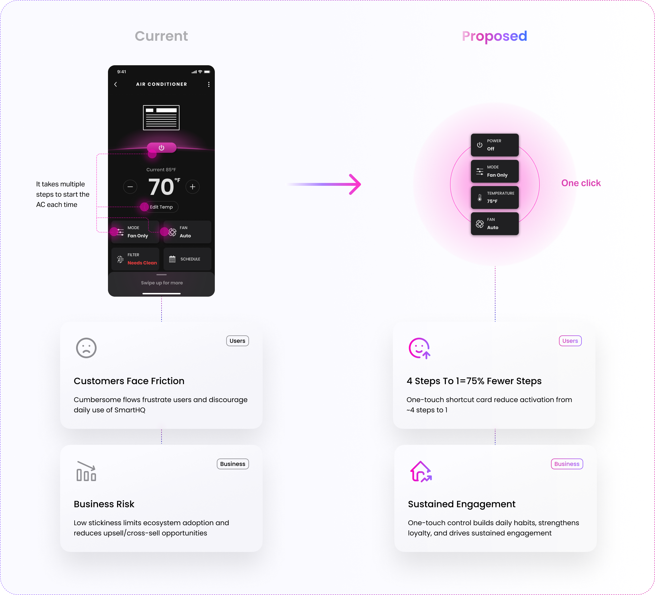
This feature enables users to quickly perform specific actions or a series of actions with just a single tap, making appliance control faster and more convenient.


Why do we need a Shortcut?
Launching shortcuts eliminates friction in appliance control, turning multi-step tasks into a single tap. This not only improves user satisfaction and efficiency but also drives stronger engagement, adoption, and retention for the business.
Cater to more scenarios…
1. Shortcuts for Instant Convenience
Imagine a user returning home from work on a hot summer day who wants to quickly turn on the air conditioner (AC) before arriving.
However, navigating through the app to locate the AC controls and adjust the settings can be tedious.
They need a faster and more efficient way to cool their living space ahead of time.


2. Shortcuts for Safety and Peace of Mind
Imagine a user who has left the oven on while cooking and moved to another part of the house. Suddenly, they realize the potential safety hazard of an unattended oven.
However, navigating through the app to locate the oven controls and turn it off can feel slow and stressful.
They need a faster and more straightforward way to ensure their home’s safety by remotely control the oven.

How might we create a seamless and welcoming shortcut experience in SmartHQ that simplifies appliance control for users while driving higher app engagement, retention, and brand loyalty for GE Appliances?

Project Timeline
First Iterations
Explore as many possibilities as we can to find the best
Enhancing the Shortcut Feature with Task-Based Iterations
We started by clearly defining the key tasks the shortcut feature needed to address, ensuring a solid foundation for the design process. With these tasks identified, we created a minimalistic initial design focused on essential flows, such as creating and editing shortcuts. This task-first approach ensured each design iteration aligned closely with user needs and goals.
Initial Shortcut Design

Design Tasks:
Redesign the home screen
a. When there are no shortcuts created
b. After creating shortcutsDesign the whole user flow of using shortcuts
a. Creating a new shortcut
b. Interaction with the button/ card
c. Editing and deleting a shortcut
Four Iterations with Critique Sessions
Throughout our UX design process, we held weekly critique sessions with the whole UX team. These sessions were instrumental in refining our designs, enabling us to explore various concepts and incorporate valuable insights from both peers and senior designers.

2. Usability Testing
Pause, reflect and improve
Validating the Design Through Internal Testing
After multiple design iterations, we finalized the key user flows: onboarding, using a shortcut, creating a shortcut, and editing or deleting a shortcut. While we felt confident in the designs, we wanted to ensure they worked seamlessly for a broader audience, not just within our UX team.

To do this, I proposed and led a usability test with colleagues from other teams who weren’t familiar with the project. Their fresh perspectives gave us valuable insights, helping us fine-tune the designs to make them more intuitive, efficient, and user-friendly.
Key Focus We Want to Test

Planning Usability Testing
To evaluate the usability of the shortcut feature, we created a prototype and a comprehensive test plan outlining goals, methods, participants, hypotheses, and procedures.
Based on our identified key focus areas, we structured the testing into three targeted sessions to gain deeper insights and address specific usability concerns.
Session 1: Onboarding
Evaluated if users understand shortcuts, feel welcomed, and can create one.
Session 2: Using Shortcut
Identify if users can edit/delete/change orders of shortcuts without confusion.
Session 3: Color Coding
Validate the idea of color coding, which helps users to distinguish the multiple shortcuts.


Session 1: Onboarding
Recognizing that a simple 'Add Shortcut' button might not sufficiently engage new users, we designed an onboarding process featuring animations to clearly explain the shortcut functionality.


Session 2: Using Shortcuts
2.1 Ceating a Shortcut
On the main page, users can create a new shortcut by clicking the "Add new shortcut" button. To streamline the development process, we repurposed the existing appliance control page design for this functionality.

2.2 Activation
We implemented a ring animation to visually indicate the process of a signal being sent to the appliance.


2.3 Editing/ Deleting
To evaluate user experience in managing shortcuts, we designed two methods for editing/ deleting them:
Edit Button Navigation: Users tap an edit button, leading to a categorized page where they can select and modify specific shortcuts.
Long-Press Interaction: Users press and hold a shortcut on the main page, similar to iPhone's method, to access editing and deletion options.
These approaches aim to determine which method enhances user experience in managing shortcuts.

Based on the assumption that an excessive number of shortcuts may hinder user operation, we developed two prototypes with varying numbers of shortcuts to observe and compare user interactions. This approach allowed us to assess how the quantity of shortcuts influences usability and user experience..
3 Shortcuts
10 Shortcuts

Session 3: Color Coding
Building on our assumption that an excessive number of shortcuts may hinder user operation, we considered using color-coded shortcut buttons to help users distinguish between them and express their preferences more effectively.

Feedback & Synthesize
After conducting usability tests with four participants from another team, we gathered valuable feedback. We organized this feedback into clusters using an affinity map, which allowed us to identify key insights for improving the design and usability of the shortcut feature


Takeaway
1. Onboarding

People want to see more precise steps for using shortcuts. Animations need to be refined for better clarity.
2. Settings Page of Shortcut

The setting page looks like control page, which might cause confusion.
3. Using Shortcuts

3. Final Refinement
Fine-tune every detail
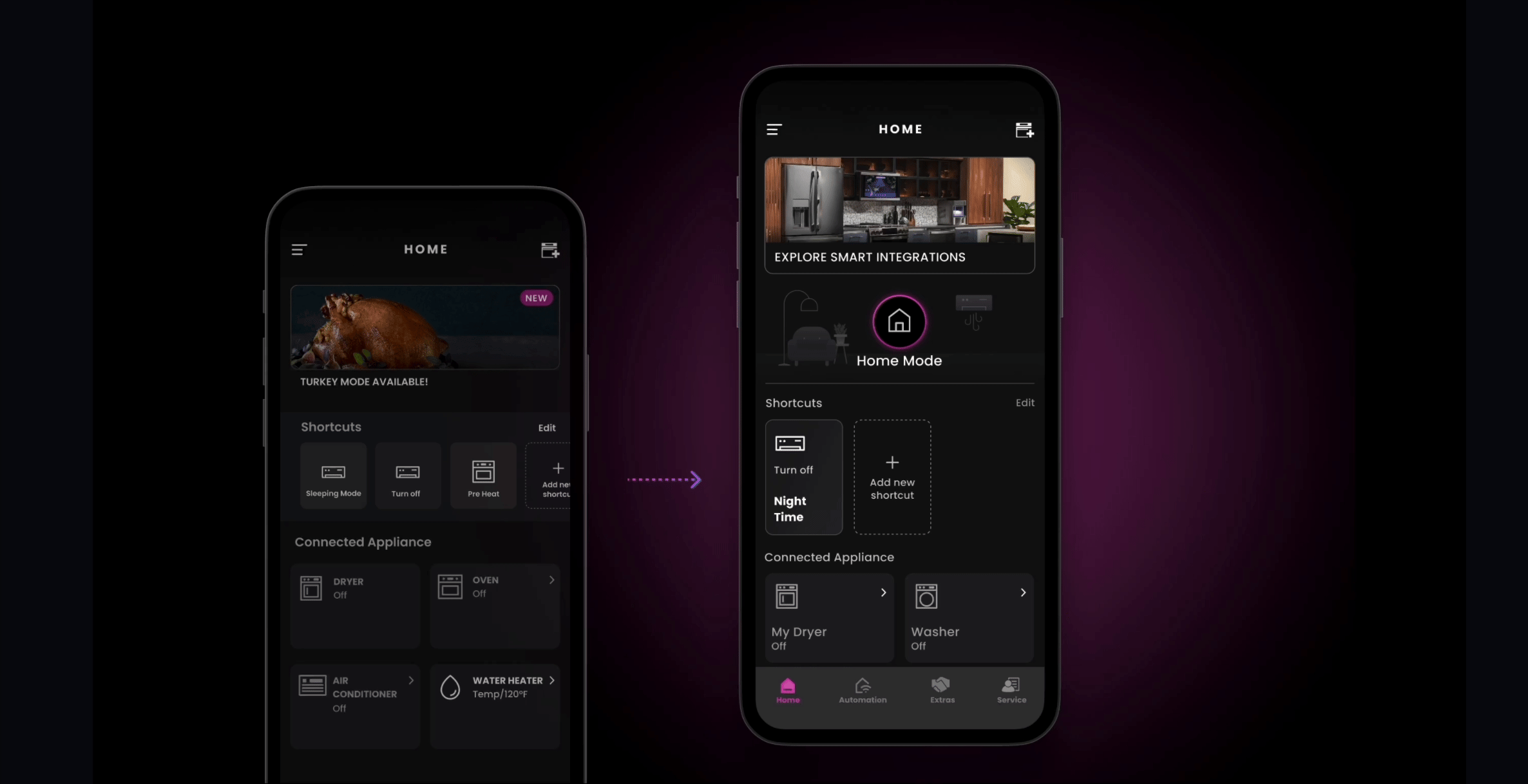
(The main page also includes changes from another project, such as home/away mode implementation and accessibility font updates.)

Shortcut Card

Customized Icons – Instead of color labels, which may cause confusion and affect brand identity, consider allowing users to customize icons for their shortcuts.
Shortcut Name & Info – Allow users to add details or settings to help them recognize specific shortcuts.
Scalable Accessibility – Ensure font size is scalable across iOS and Android for better accessibility.
Real-time Feedback loop
To ensure clear communication and smooth development, we brainstormed several variations of the feedback loop design. After thorough discussion, we finalized version 3 as the optimal solution.

Feedback Loop Flow

Onboarding
We collaborated with the animation team to make significant improvements to the onboarding animation based on user feedback. We redesigned the illustrations and simplified the animations to clearly demonstrate the shortcut features. These enhancements aim to make the onboarding experience more effective and welcoming.

Step 2
How to use Shortcut?

Step 1
What’s shortcut?
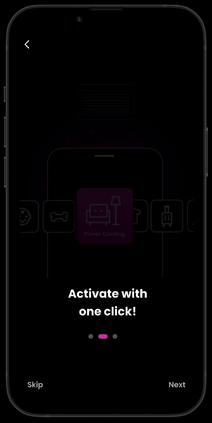
Step 3
Get Started!
User flow
1. Creating a Shortcut
Users go through three steps when creating a new shortcut:
Setup – The settings page allows users to easily configure their shortcut.
Customization – Users can name their shortcut and select an icon from a rich library, making identification easier.
Review – A preview page lets users see how their shortcut will look and function before saving, giving them the opportunity to make adjustments and ensure proper setup.

2. Editing a Shortcut
To prevent users from confusing the settings page with a control page, we redesigned it to ensure clear differentiation.

4. Development & Launch
Smooth handoff, seamless launch, with aligned and achievable goals
MVP for Initial Launch
After refining our design, we collaborated with the engineering team to assess the feasibility of launching the shortcut feature. They highlighted challenges in implementing 50 icons and the complexity of shortcut creation. To simplify the process, we decided to focus the initial launch on AC and oven units, assigning icons based on the appliance. We remain committed to expanding to all 50 icons in a future release.

Design System: Shortcuts Feature
We developed a mini design system for the shortcut feature to boost UX team communication and streamline our design process. Grounded in Brad Frost's atomic design principles, this reference guide ensures our team works consistently and efficiently toward a unified final product.

Project Documentation: Setting the Foundation
Before handing off the project to the development team, we created comprehensive documentation covering the project's specifications, interface components, and implementation guidelines. This detailed groundwork ensures smooth collaboration and helps maximize the quality of deliverables.


Exceptional Results
Through the collaborative efforts of cross-functional teams—including development, product management, design, and motion graphics—spanning the United States, Korea, and India, we successfully launched our new feature.
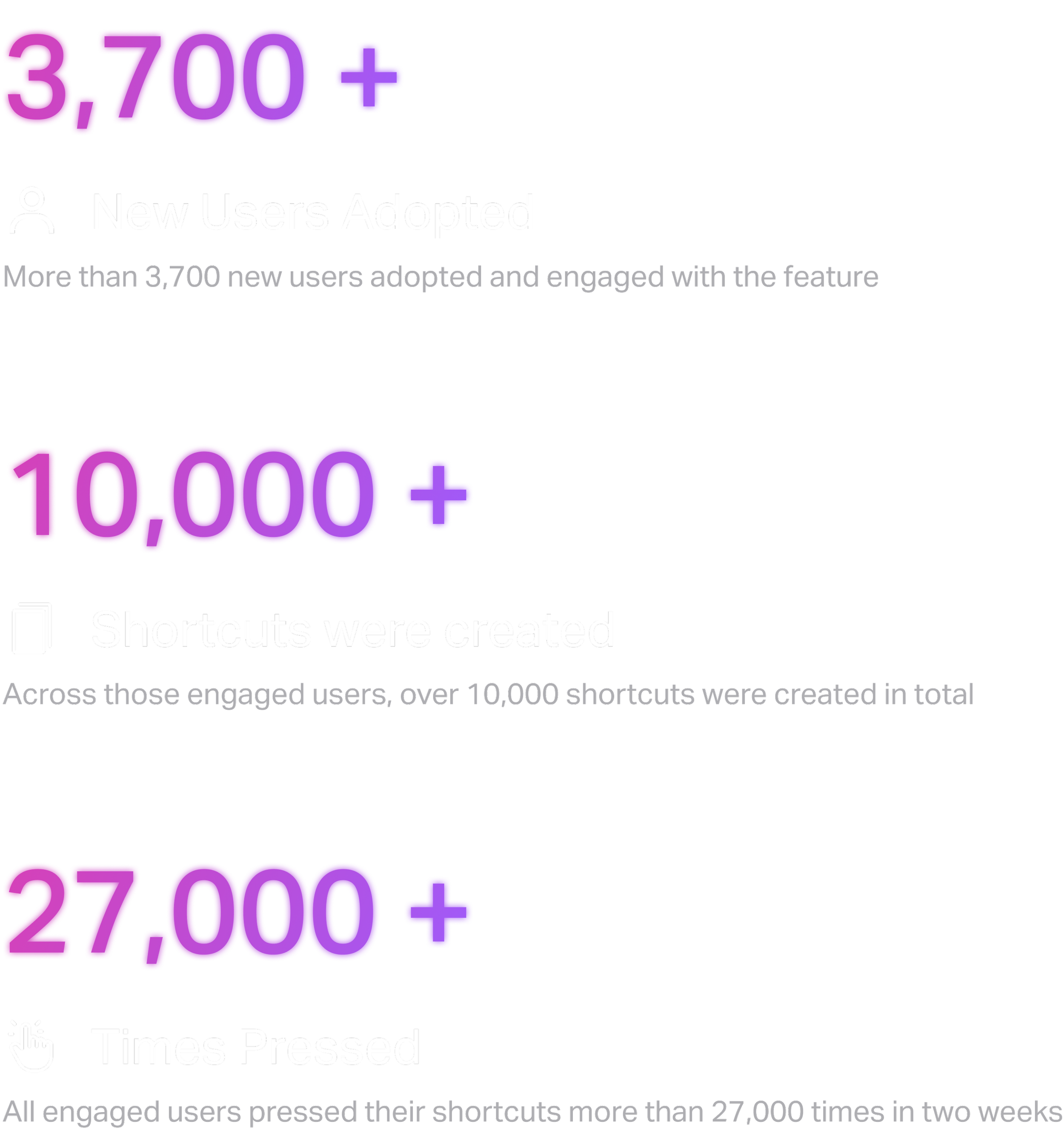
Within the first two weeks of launch, the iOS Shortcut feature drove strong adoption, bringing in over 3,700 new users. Together, these users created more than 10,000 shortcuts, which were activated over 27,000 times. These results reflect iOS only, with further growth anticipated once Android adoption is included.
While further quantitative and qualitative research is necessary to fully assess user satisfaction, these early results clearly demonstrate the feature’s significant contribution to improving user convenience and productivity.

What I Learned ?

Last but not the least !


Throughout this journey, I received invaluable support and guidance from my mentor, superiors, and fellows, which has been instrumental in my growth as a designer and individual. Collaborating with such a talented and passionate team has enriched my professional journey, providing diverse perspectives and fostering continuous learning.
Working alongside talented teams in such a collaborative environment has been inspiring, fostering both professional growth and meaningful connections.
Thank you to everyone who made this journey so meaningful! 🩵


